Sinerjik
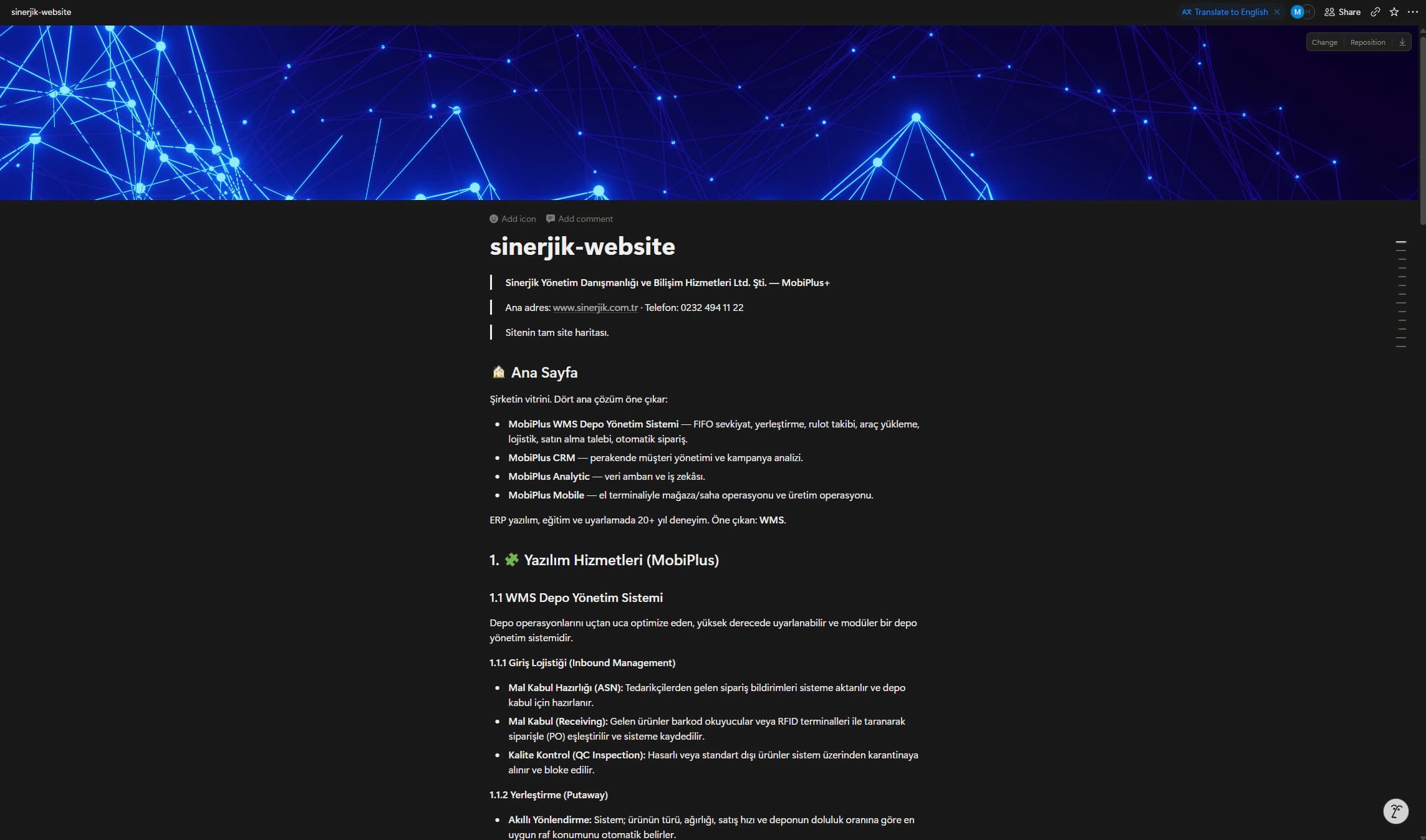
Sinerjik sells consulting services and MoBI Plus+, a software suite used in daily operations for more than 20 years. I designed a website that doubled as its sales presentation; the client used it in four pitches and signed one new client.
Problem
Sinerjik's website had to explain two sides of the business.
The company provides management consulting. It also develops MoBI Plus+, a suite for warehouses, sales, customer management, and reporting.
The old website did not explain either side clearly. It was also difficult to use during client meetings.
MoBI Plus+ added another constraint. It is mature software with a dense interface. The client did not want to show those screens on the new site.
I needed to show what the software did without showing its actual interface. The result also had to work for people browsing alone and for the team presenting in a meeting.
Approach
I started with the company documents, product details, services, customer references, and existing brand material.
I used my visual communication background to turn that material into a presentation. Each section made one point and showed the proof behind it.
- 01What does Sinerjik help companies do?
- 02What proves its experience?
- 03How do the products work together?
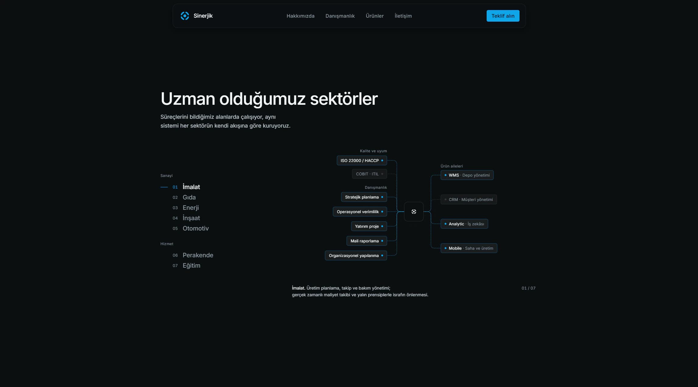
- 04Which services fit each sector?
The answers set the page order: promise, proof, business areas, sector fit, and contact.
The client checked the content throughout the project. Their feedback corrected company figures, contact details, and the link between sectors and services.
I did not conduct formal user research. The decisions came from the client's product knowledge and sales needs.
Solution
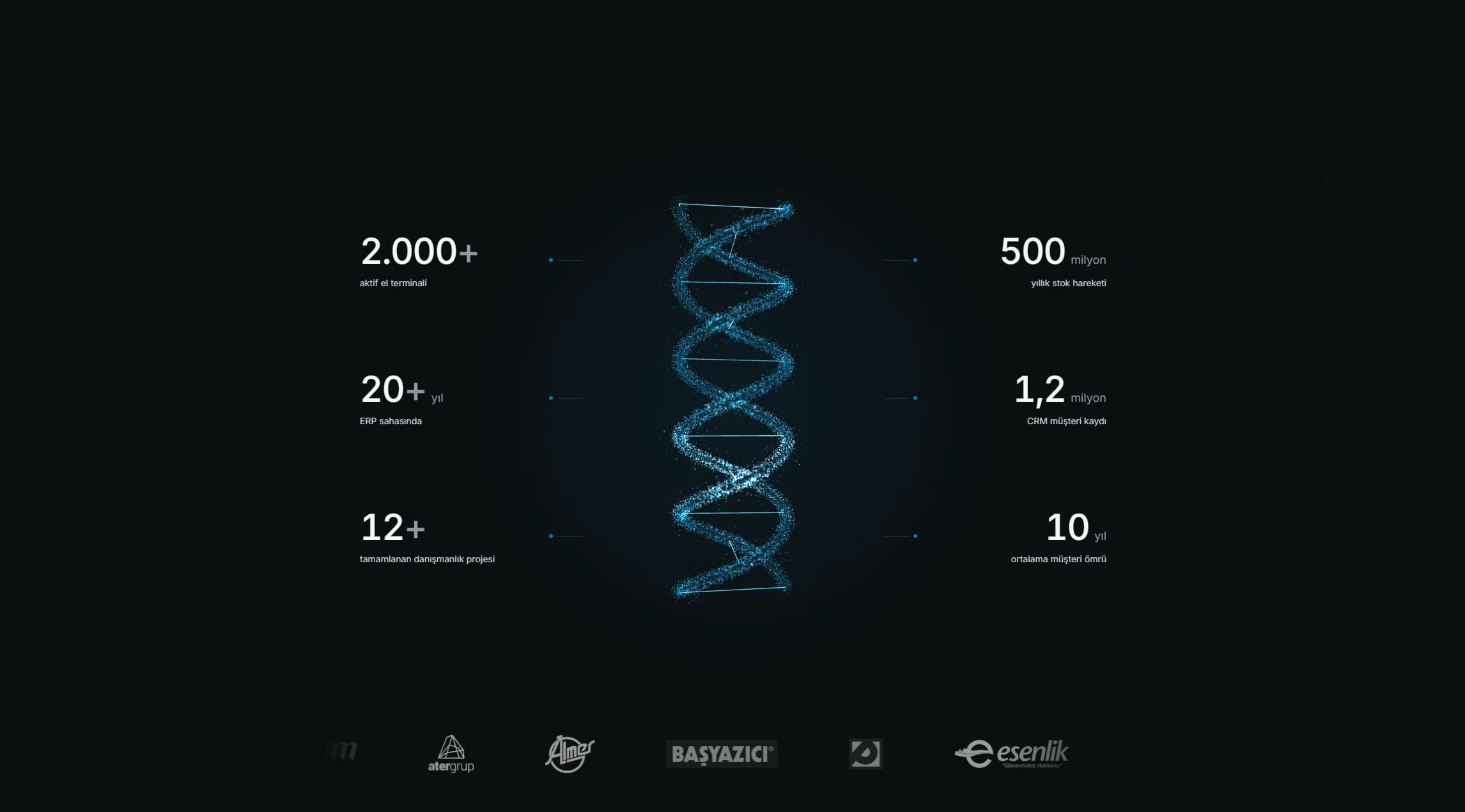
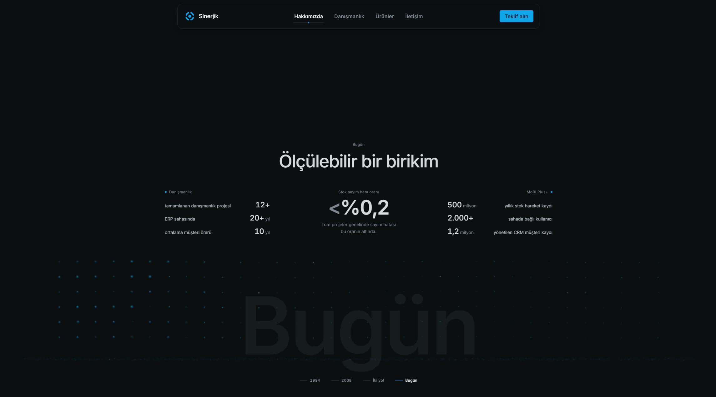
Put proof near the top
Sinerjik had strong facts to support its offer. These included more than 20 years of software experience, long client relationships, and large volumes of operational data.
The homepage shows this evidence before explaining every service. A visitor can judge the company early, while the team can point to the same facts during a pitch.
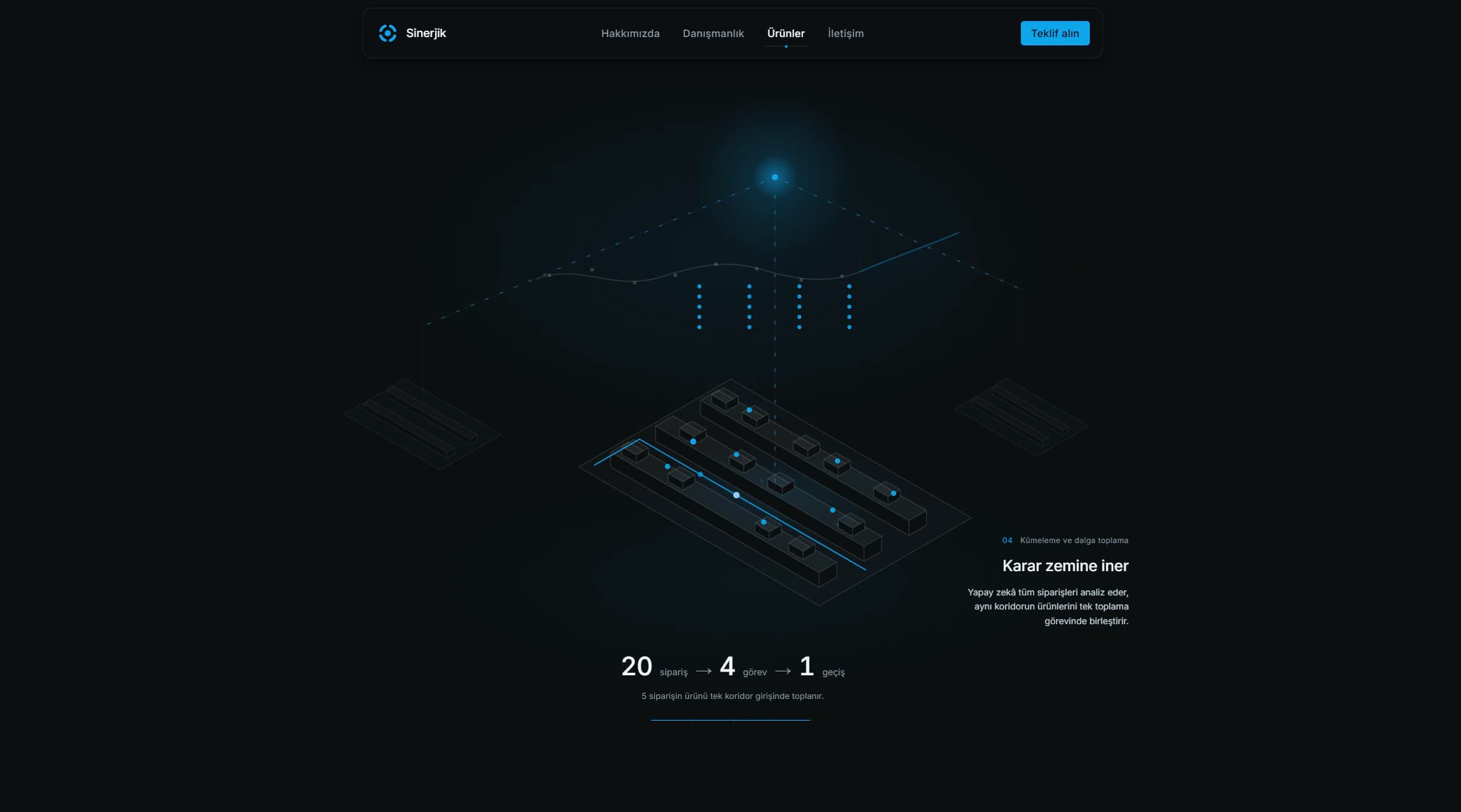
Show the software through a working example
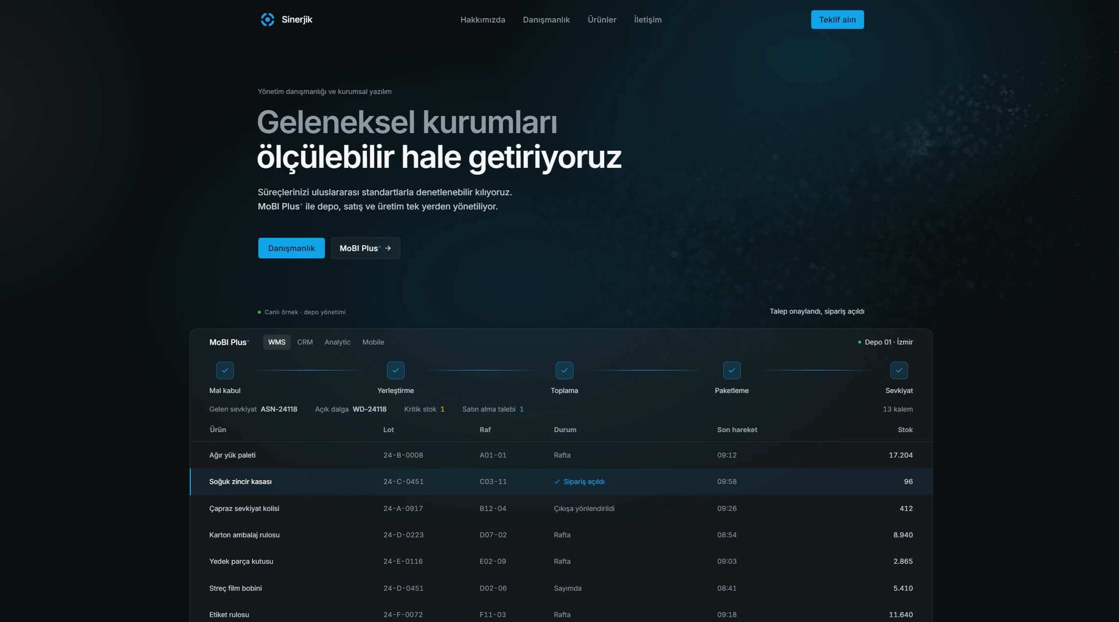
Product screenshots were not available. A feature list alone would leave MoBI Plus+ hard to understand.
I built a warehouse demonstration from the product's real behavior. A delivery arrives, receives a rack, moves through picking, reaches low stock, and triggers a new order.
The labels and steps come from MoBI Plus+. The visual design is new, but the workflow is based on the real product.
Show how the products connect
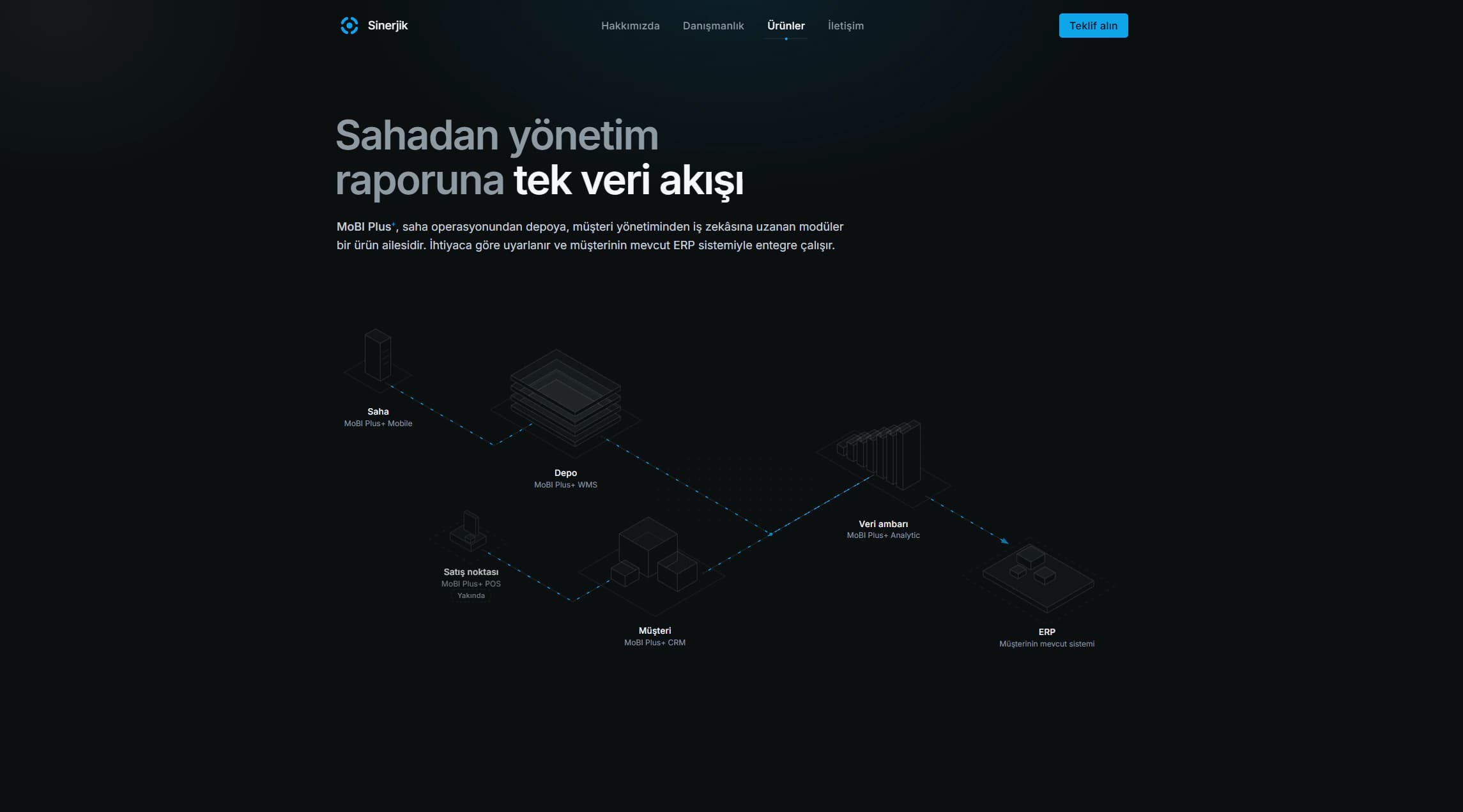
MoBI Plus+ includes four products. Listing them separately would make the suite harder to understand.
I presented them as one flow. Mobile records field activity, WMS manages the warehouse, CRM handles customers, and Analytic connects the data to the customer's ERP.
This gives the sales team one diagram for explaining the full suite.
Match sectors with the right offer
Sinerjik works across manufacturing, food, energy, construction, automotive, retail, and education.
A long capability list would make every sector look the same. I designed an interactive section that changes the standards, services, and products shown for each sector.
This helps visitors find relevant information. It also lets the team adjust a pitch without changing pages.
Output
I designed the site structure, interface, visual system, and motion. I also directed the front-end build with Claude Code.
I delivered a responsive Turkish website with five public pages: homepage, company, consulting, products, and contact.
The website also includes coded product demonstrations, responsive diagrams, a contact form, and a documented design system.
The same site can introduce Sinerjik, support a sales conversation, or explain a product flow.
Impact
The client used the website in four pitches after launch. One of those pitches led to a signed client.
During those meetings, the team could present the company, show how MoBI Plus+ works, and explain which services fit the potential client.
The website also removed a product marketing blocker. Sinerjik could demonstrate MoBI Plus+ without exposing its production interface or waiting for a full product redesign.
The coded demonstrations gave the software a clear visual layer while the production product stayed unchanged. The client later thanked me for making the business and software easier to explain.