OFK Construction
OFK had completed projects and signed references, but no digital home for either. I built a bilingual website that helps corporate buyers inspect the work before making contact.
Problem
OFK’s reputation lived in completed projects, client relationships, photographs, and signed references. Online, the company had little more than a logo.
A buyer could not assess OFK in one place. They had to piece the story together from files and conversations.
The website also needed to support pitches, meetings, and early project discussions.
Approach
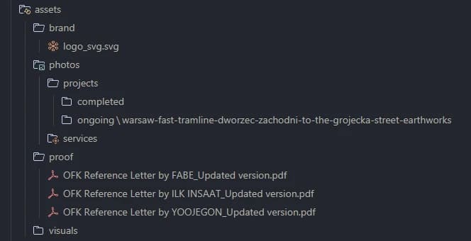
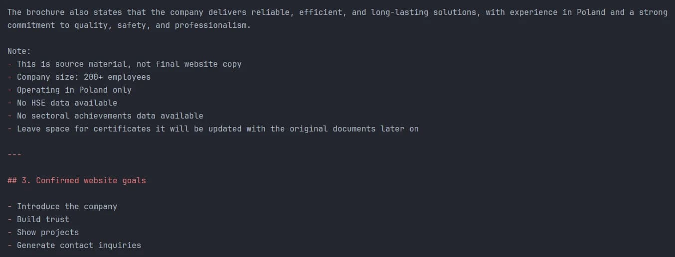
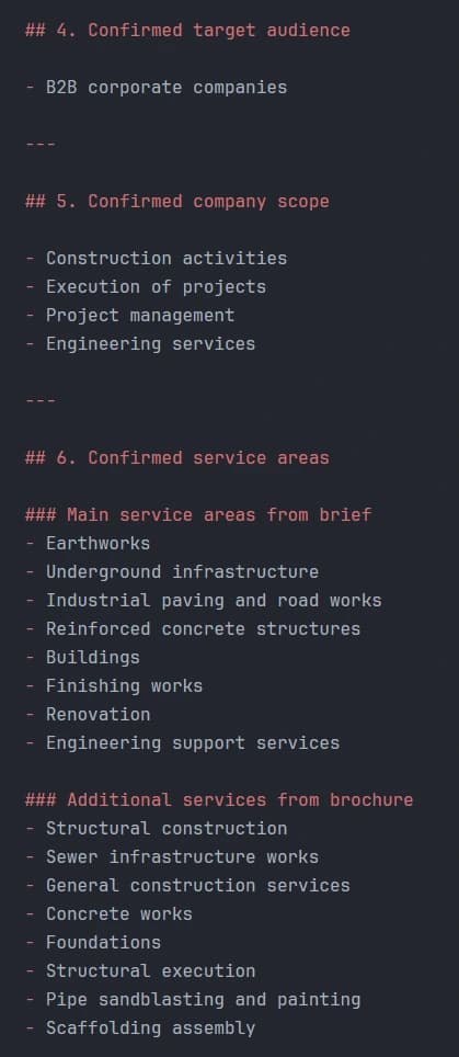
I reviewed company documents, project records, photographs, service information, and three signed references.
- 01Can OFK perform the required work?
- 02Has it delivered something comparable?
- 03Who can verify that experience?
- 04How can a buyer start a conversation?
Projects, technical scopes, and references gave the strongest answers. Broad company claims carried less weight without evidence.
That set the hierarchy. Company information stayed brief, while project evidence had room for closer review.
The client wanted to avoid platform fees and dependence on a website builder. I chose React so OFK could own and extend the website.
Solution
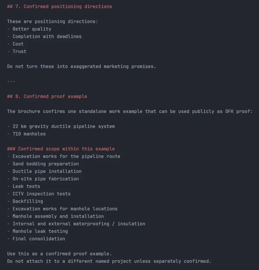
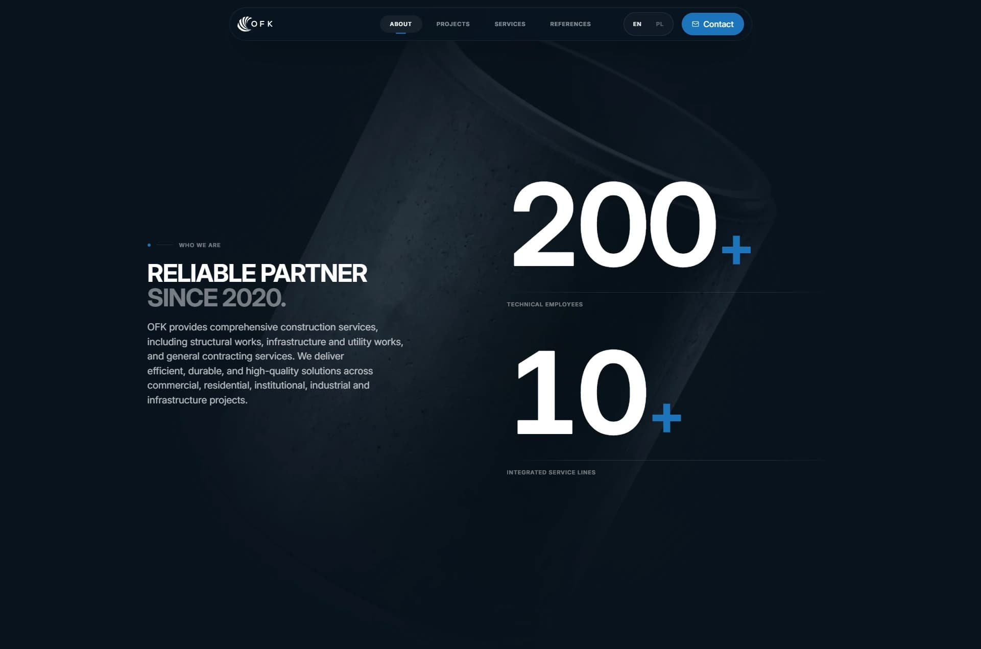
I extended OFK’s logo into a digital identity. One blue accent, blue-gray neutrals, clear type, and firm spacing gave the website a technical voice.
The website follows one rule: state the point, show the proof, then offer more detail.
Projects became the proof
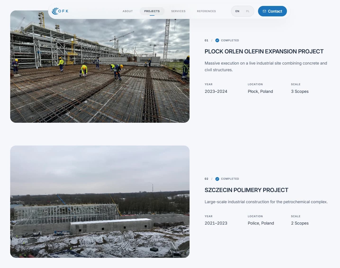
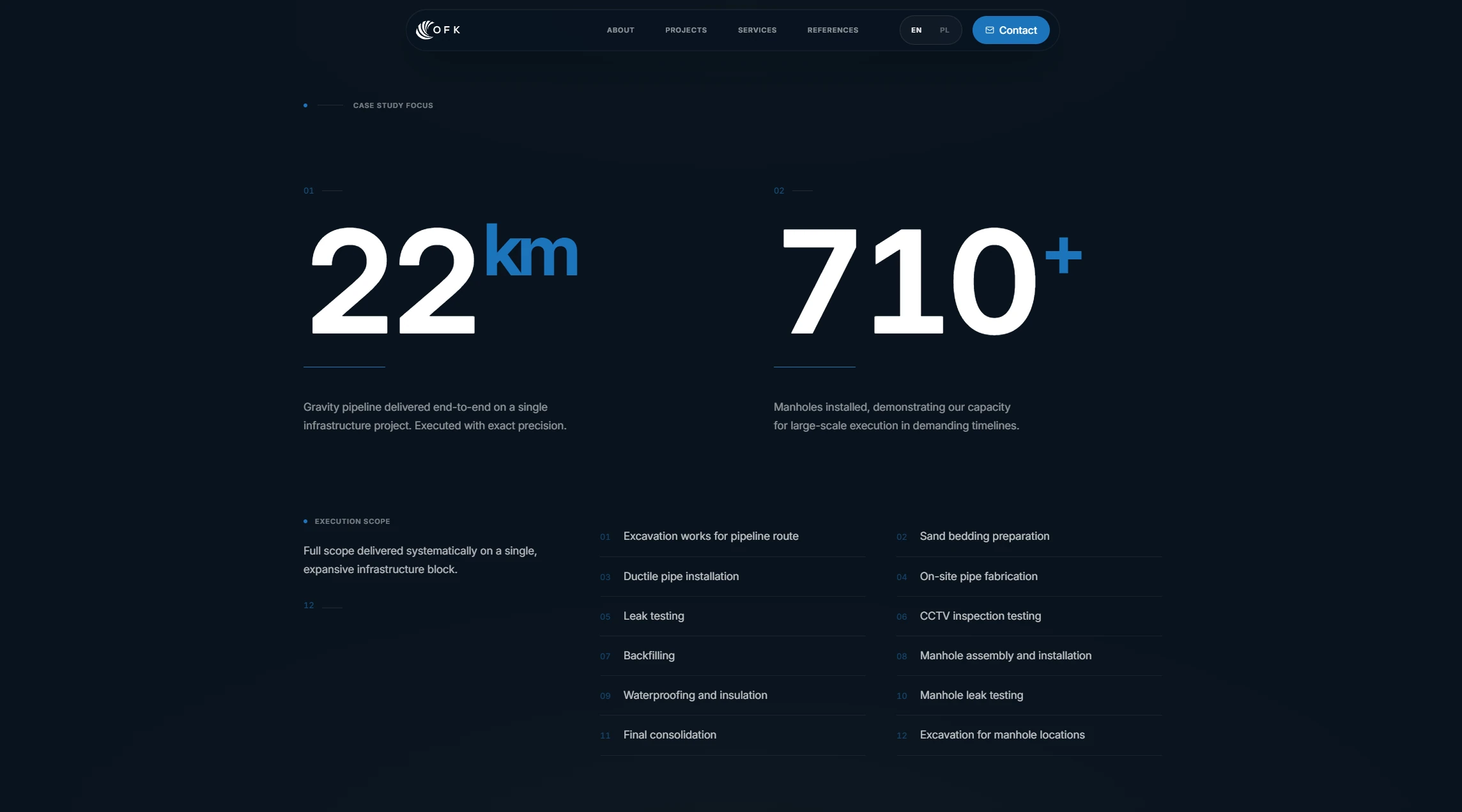
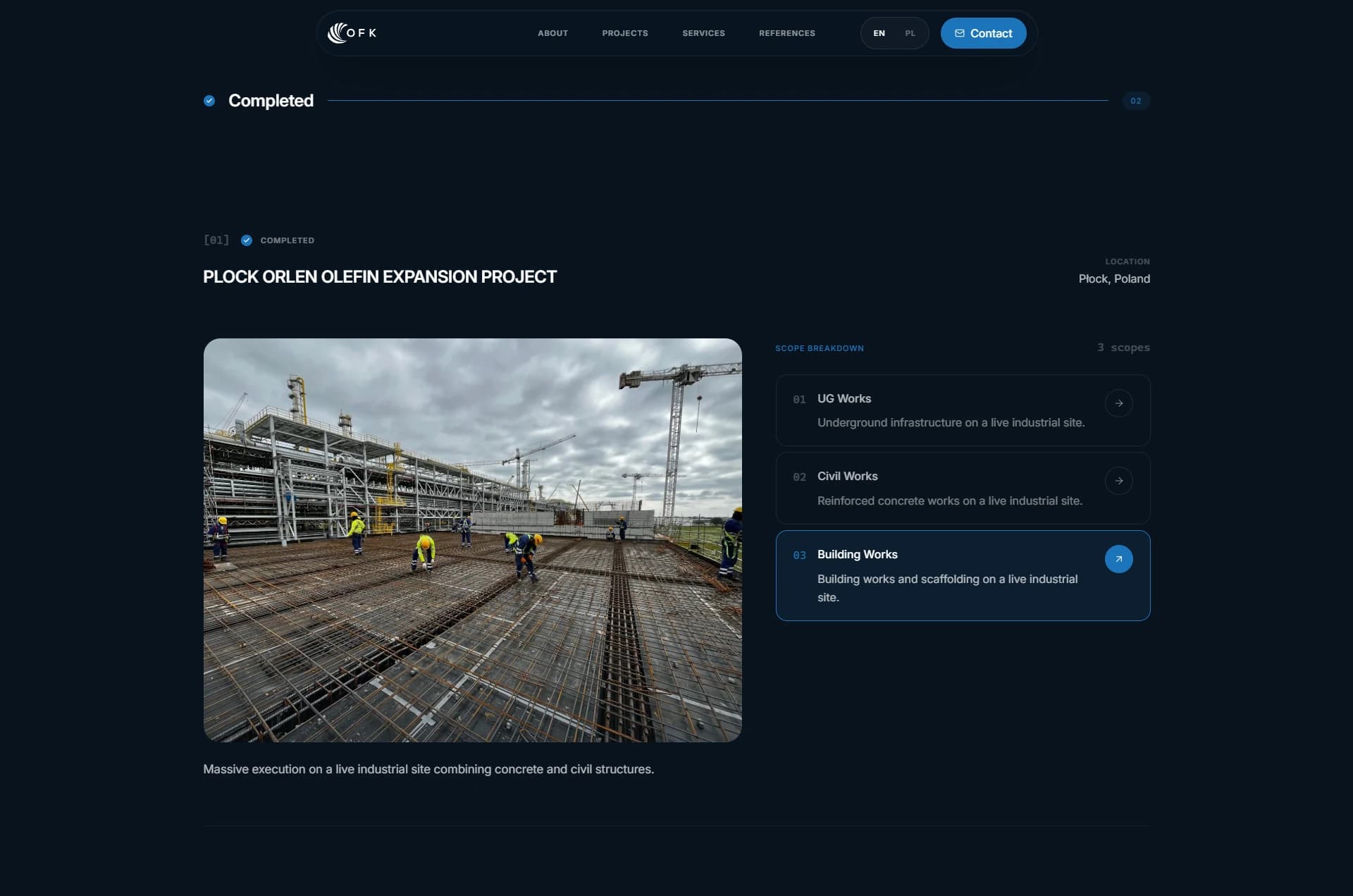
A service list says what OFK offers. A named project shows that the company has delivered it. Each project connects its location, photography, technical scope, and execution details in one place.
References stayed verifiable
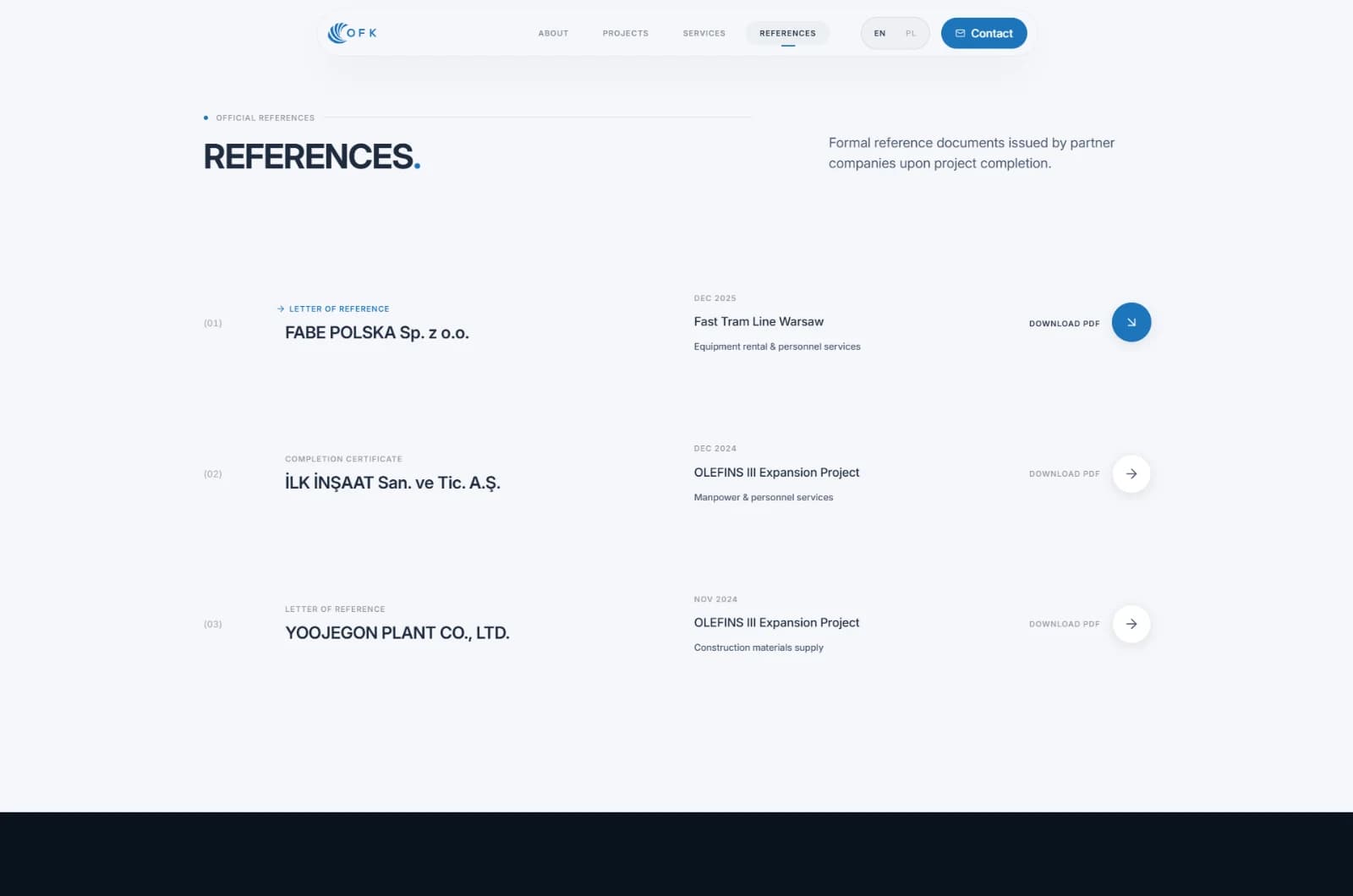
A company name suggests credibility. A signed document lets a buyer inspect the claim. Each reference connects to its company, project, scope, and original file.
Two languages shared one system
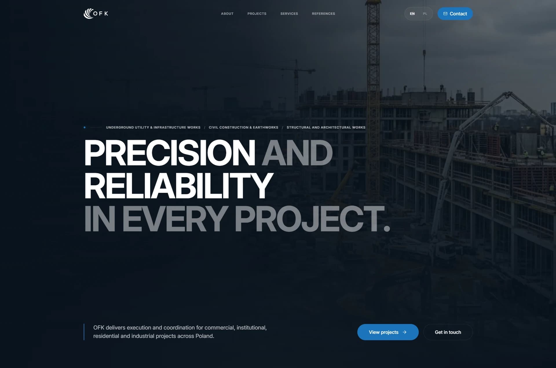
Separate sites would double the work and invite mismatched content. English and Polish share one structure, persistent language choice, and stable navigation.

Output
I led product strategy, identity, UX/UI, and the front-end build.
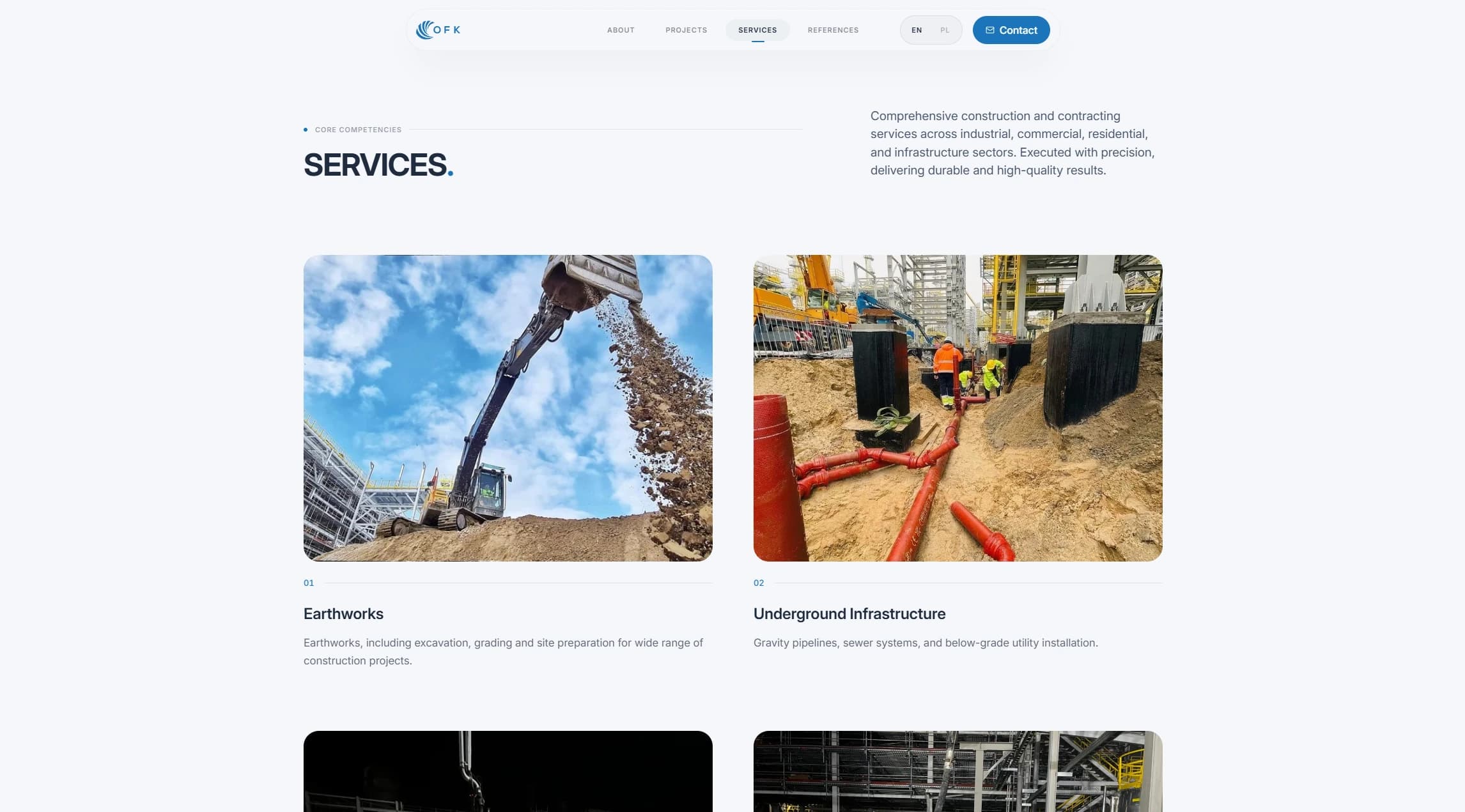
I shipped a company overview, services, named projects, technical scopes, responsive galleries, downloadable references, and direct contact paths.
The same website can introduce OFK online, guide a meeting, or support a project discussion with evidence.
Impact
OFK moved from a logo and scattered files to a live bilingual website.
Buyers can now inspect projects, review technical scope, download signed references, and make contact in one place.
The website also gives OFK one presentation tool for pitches and meetings.
No before-and-after analytics were available. The verified change is that OFK’s work is now public and easier to inspect.